WeChat Content Best Practices [March]
As the rest of the world went on lockdown, China's economy begun slowly stirring back to life. We're seeing more and more fun and lighthearted campaigns welcoming the onset of Spring and returning back to more of a regular schedule.
We’re back sharing our top 5 favorite posts with you below which cover different ways you can craft compelling copy, visuals and engaging content for WeChat.
Brand: 135editor.com
Best Practice: Interactive Quiz
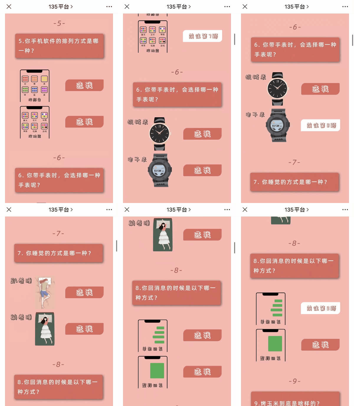
What is the best way to sell the paid course for formatting skills training?
Show them how many brilliant things you can do in one post!
135editor.com is one of the third party platforms you can use to format WeChat posts.
They created this personal preference test game to engage more followers and promote their online courses.
The game is designed to be entertaining, with options that are very quirky and funny, but also so relevant to people’s daily life that almost anyone can participate and it begs to be shared.
Brand: Everlane
Best Practice: Click to discover
Another interesting form of a quiz this month comes from Everlane.
The difference is, people don’t need to play until very end to get the answers. They can simply click on the blank spot of each question and then the answer will appear immediately.
This keeps readers engaged and learning about the brand throughout the full post.
This is especially helpful for when a brand wants to share important but maybe a bit boring information, such as certificates, materials, standards and so on — through this process you can keep the reader curious instead of just giving them a long article to aimlessly scroll through.
LALU
Best Practice: Bilingual posts
If you’re looking to reach a bilingual audience you’ve likely struggled with how to create articles — should you put one language after another paragraph by paragraph, or the entire text in one language first and the other one second, should you create separate articles?
There is no right answer, as a brand you’ll need to decide what is best for your audience and your goals.
Some things to consider;
How long having both languages together makes one article
What is your following size of foreigner vs Chinese and which are you trying to grow
How much the layout & visuals are affected
One way is to include both Chinese and English by creating a slider. The reader can slide the text to the right to view the second language as Lalu has done with their post.
Brand: BMW
Best Practice: Attention-grabbing title
This post is great because;
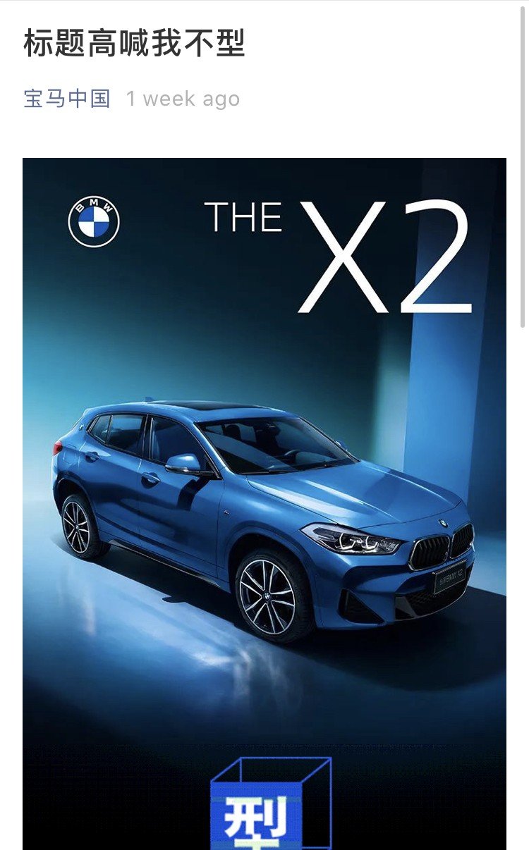
1) They use a catchy title to make people want to click in.
Title: “Here, in this title, I shout out that I’m not stylish (capable)”
“Xing” (型) in Chinese means “Stylish”, also sounds like “Xing” (行) which means “capable”.
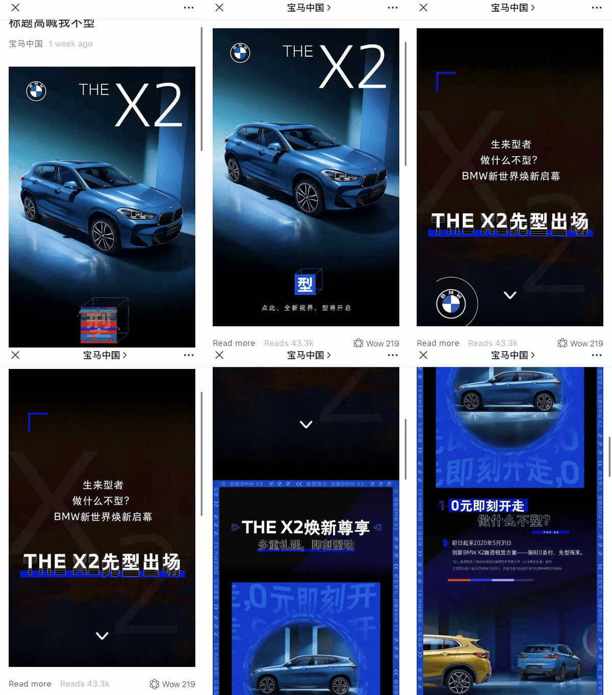
2) When click into the article, you will only see one picture first. Then there is a spinning box in the bottom waiting for you to click on it
3) When you hit the box, the single picture will turn into a long graphic content in 3 seconds.
The reading experience is full of a high-tech feeling. It doesn’t matter what they say in the text actually, the reader can be impressed right away.
So, yeah we can say BMW, as a brand, is COOL
Brand: 五芳斋(Wu Fang Zhai)
Best Practice: Clever Cartoon
Qing Tuan ( Sweet Green Dumpling ) is a seasonal dessert with over a thousand of years history in China. They launch this product to the market on March every year.
As one of the traditional food companies, famous for its creation, Wu Fang Zhai released this cute article on its WeChat account to target the younger generation.
They made a cartoon called “The Important Principles in Qing Tuan’s Life” to tell people how much effort is needed to make the Qing Tuan taste delicious, and also encourage audience to share with love.
They also have a great QR code at the end of the article.


